一般看到的 AppBarButton 都是图片在上面,文字在下面,是否可以更改让文字在和图片相同的位置?本文告诉大家如何做出横向的 AppBarButton 把图标和文本放在一起。
如果需要添加 AppBarButton 一般都是用于显示图标,但是有时候图标不知道功能,就需要添加文本,添加文本的代码很简单。
<AppBarButton Icon="Back" Margin=" 30 40 0 0" Label=" CitiKiosk Settings">这样看起来的界面就是
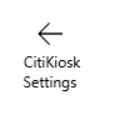
但是如果要做出下面的图片的样子,就需要修改Style,下面我来告诉大家如何做出下面图片

首先在资源写下面的Style,建议写在 Page 的资源,这样在整个页面都可以指定
        <Style TargetType="AppBarButton">            <Setter Property="Background" Value="Transparent"/>            <Setter Property="Foreground" Value="{ThemeResource SystemControlForegroundBaseHighBrush}"/>            <Setter Property="HorizontalAlignment" Value="Left"/>            <Setter Property="VerticalAlignment" Value="Top"/>            <Setter Property="FontFamily" Value="{ThemeResource ContentControlThemeFontFamily}"/>            <Setter Property="FontWeight" Value="Normal"/>            <Setter Property="UseSystemFocusVisuals" Value="True" />            <Setter Property="Template">                <Setter.Value>                    <ControlTemplate TargetType="AppBarButton">                        <Grid x:Name="Root"                              MinWidth="{TemplateBinding MinWidth}"                              MaxWidth="{TemplateBinding MaxWidth}"                              Background="{TemplateBinding Background}">                            <VisualStateManager.VisualStateGroups>                                <VisualStateGroup x:Name="ApplicationViewStates">                                    <VisualState x:Name="FullSize"/>                                    <VisualState x:Name="Compact">                                        <Storyboard>                                            <ObjectAnimationUsingKeyFrames Storyboard.TargetName="TextLabel" Storyboard.TargetProperty="Visibility">                                                <DiscreteObjectKeyFrame KeyTime="0" Value="Collapsed"/>                                            </ObjectAnimationUsingKeyFrames>                                        </Storyboard>                                    </VisualState>                                    <VisualState x:Name="Overflow">                                        <Storyboard>                                            <ObjectAnimationUsingKeyFrames Storyboard.TargetName="ContentRoot" Storyboard.TargetProperty="Visibility">                                                <DiscreteObjectKeyFrame KeyTime="0" Value="Collapsed"/>                                            </ObjectAnimationUsingKeyFrames>
                                        </Storyboard>                                    </VisualState>                                    <VisualState x:Name="OverflowWithToggleButtons">                                        <Storyboard>                                            <ObjectAnimationUsingKeyFrames Storyboard.TargetName="ContentRoot" Storyboard.TargetProperty="Visibility">                                                <DiscreteObjectKeyFrame KeyTime="0" Value="Collapsed"/>                                            </ObjectAnimationUsingKeyFrames>

                                        </Storyboard>                                    </VisualState>                                </VisualStateGroup>                                <VisualStateGroup x:Name="CommonStates">                                    <VisualState x:Name="Normal">                                        <Storyboard>                                        </Storyboard>                                    </VisualState>                                    <VisualState x:Name="PointerOver">                                        <Storyboard>                                            <ObjectAnimationUsingKeyFrames Storyboard.TargetName="Root" Storyboard.TargetProperty="Background">                                                <DiscreteObjectKeyFrame KeyTime="0" Value="{ThemeResource SystemControlHighlightListLowBrush}"/>                                            </ObjectAnimationUsingKeyFrames>                                            <ObjectAnimationUsingKeyFrames Storyboard.TargetName="Content" Storyboard.TargetProperty="Foreground">                                                <DiscreteObjectKeyFrame KeyTime="0" Value="{ThemeResource SystemControlHighlightAltBaseHighBrush}"/>                                            </ObjectAnimationUsingKeyFrames>                                            <ObjectAnimationUsingKeyFrames Storyboard.TargetName="TextLabel" Storyboard.TargetProperty="Foreground">                                                <DiscreteObjectKeyFrame KeyTime="0" Value="{ThemeResource SystemControlHighlightAltBaseHighBrush}"/>                                            </ObjectAnimationUsingKeyFrames>
                                        </Storyboard>                                    </VisualState>                                    <VisualState x:Name="Pressed">                                        <Storyboard>                                            <ObjectAnimationUsingKeyFrames Storyboard.TargetName="Root" Storyboard.TargetProperty="Background">                                                <DiscreteObjectKeyFrame KeyTime="0" Value="{ThemeResource SystemControlHighlightListMediumBrush}"/>                                            </ObjectAnimationUsingKeyFrames>                                            <ObjectAnimationUsingKeyFrames Storyboard.TargetName="Content" Storyboard.TargetProperty="Foreground">                                                <DiscreteObjectKeyFrame KeyTime="0" Value="{ThemeResource SystemControlHighlightAltBaseHighBrush}"/>                                            </ObjectAnimationUsingKeyFrames>                                            <ObjectAnimationUsingKeyFrames Storyboard.TargetName="TextLabel" Storyboard.TargetProperty="Foreground">                                                <DiscreteObjectKeyFrame KeyTime="0" Value="{ThemeResource SystemControlHighlightAltBaseHighBrush}"/>                                            </ObjectAnimationUsingKeyFrames>                                        </Storyboard>                                    </VisualState>                                    <VisualState x:Name="Disabled">                                        <Storyboard>                                            <ObjectAnimationUsingKeyFrames Storyboard.TargetName="Content" Storyboard.TargetProperty="Foreground">                                                <DiscreteObjectKeyFrame KeyTime="0" Value="{ThemeResource SystemControlDisabledBaseMediumLowBrush}"/>                                            </ObjectAnimationUsingKeyFrames>                                            <ObjectAnimationUsingKeyFrames Storyboard.TargetName="TextLabel" Storyboard.TargetProperty="Foreground">                                                <DiscreteObjectKeyFrame KeyTime="0" Value="{ThemeResource SystemControlDisabledBaseMediumLowBrush}"/>                                            </ObjectAnimationUsingKeyFrames>
                                        </Storyboard>                                    </VisualState>                                </VisualStateGroup>                                <VisualStateGroup x:Name="InputModeStates">                                    <VisualState x:Name="InputModeDefault" />                                    <VisualState x:Name="TouchInputMode" >                                    </VisualState>                                </VisualStateGroup>                            </VisualStateManager.VisualStateGroups>
                            <StackPanel x:Name="ContentRoot" MinHeight="{ThemeResource AppBarThemeCompactHeight}" Orientation="Horizontal">                                <ContentPresenter x:Name="Content"                                                  Height="20"                                                  Margin="0,0,0,4"                                                  Content="{TemplateBinding Icon}"                                                  Foreground="{TemplateBinding Foreground}"                                                  HorizontalAlignment="Stretch"                                                  AutomationProperties.AccessibilityView="Raw"/>                                <TextBlock x:Name="TextLabel"                                           Text="{TemplateBinding Label}"                                           Foreground="{TemplateBinding Foreground}"                                           FontSize="30"                                           FontFamily="{TemplateBinding FontFamily}"                                           TextAlignment="Center"                                           TextWrapping="Wrap"                                           Margin="10,0,0,6"                                           VerticalAlignment="Center"/>                            </StackPanel>
                        </Grid>                    </ControlTemplate>                </Setter.Value>            </Setter>        </Style>
使用的时候,只需要和上面的代码一样,不需要做修改,不过可能出现文字有部分不显示,所以需要设置长度
<AppBarButton Width="300" Icon="Back" Margin="30 0 0 0" Label="CitiKiosk Settings" />
原文链接: http://blog.lindexi.com/post/win10-uwp-%E6%A8%AA%E5%90%91-AppBarButton
本作品采用 知识共享署名-非商业性使用-相同方式共享 4.0 国际许可协议 进行许可。 欢迎转载、使用、重新发布,但务必保留文章署名 林德熙 (包含链接: https://blog.lindexi.com ),不得用于商业目的,基于本文修改后的作品务必以相同的许可发布。如有任何疑问,请与我 联系。